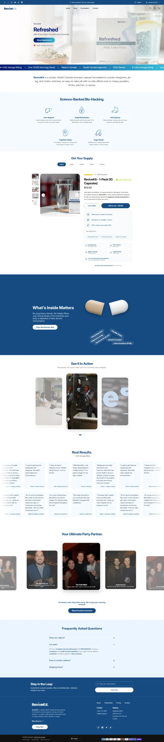
ReviveKit sells one product, a licensed capsule for hangovers, jet lag and motion sickness. A single product store has nowhere to hide. There is no catalogue to browse, so every section either moves the visitor toward cart or wastes their scroll.
The challenge
- One SKU across six pack sizes, meaning the whole site is effectively one long product page
- A regulated health product needing licensing and ingredient transparency without killing the tone
- The audience buys on social proof, but reviews alone do not answer how it works
- Two very different buying moments to serve, planned purchase and next morning urgency
What we built
- Bright, clean design with the product photography leading and a wide brand blue used for emphasis blocks
- Announcement bar plus a scrolling proof ticker covering rating, mornings saved, Canadian manufacture, licensing and natural formulation
- Plain language positioning statement directly under the hero, stating exactly what the product is
- Mechanism section breaking the formulation into five benefits, so the buyer understands why it works before being asked to buy
- Full inline product module with pack size selector, image gallery, live stock status, price, key ingredient chips, trust badges and add to cart, all without leaving the homepage
- Ingredient transparency block on brand blue with dosage chips and a link to the full nutritional label
- Video testimonial carousel, a large text review wall, and a lifestyle occasion carousel framing when to use it
- FAQ accordion covering timing, safety and licensing, caffeine content and shipping
- Newsletter capture, multi currency and language switchers, and full payment method display in the footer
Conversion Structure
The product module sits at the top third of the page rather than at the bottom, so ready buyers never have to hunt for it. Everything below exists to answer the objections of visitors who are not ready yet, and each block is followed by another route back to cart. Pack size selection is presented as a tab row rather than a dropdown, making the bulk options visible instead of hidden.
Compliance Handling
Product licensing and the NPN number are stated inside the FAQ rather than in fine print, alongside the manufacturing and monitoring claims. Ingredient dosages are published rather than hidden behind a proprietary blend, which serves as both a trust signal and a regulatory safeguard.
Results
Better UI and UX across the buying journey, resulting in more visitors reaching checkout.